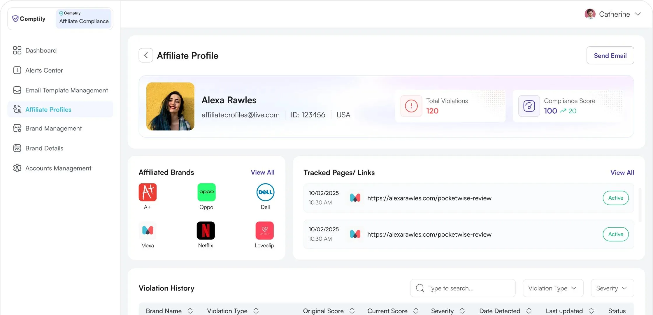
Showing teams which affiliates need attention, and why.
- Project name
- Complily affiliate compliance web app
- My role
- End-to-end product design
- Industry
- B2B SaaS
Product Overview
Complily helps brands keep their affiliate marketing compliant. It tracks affiliate pages, flags violations of rules such as FTC, FDA and SEC guidance, and turns each affiliate's findings into a compliance score. Compliance teams review alerts, email affiliates and track each fix from the same workspace.
The Problem
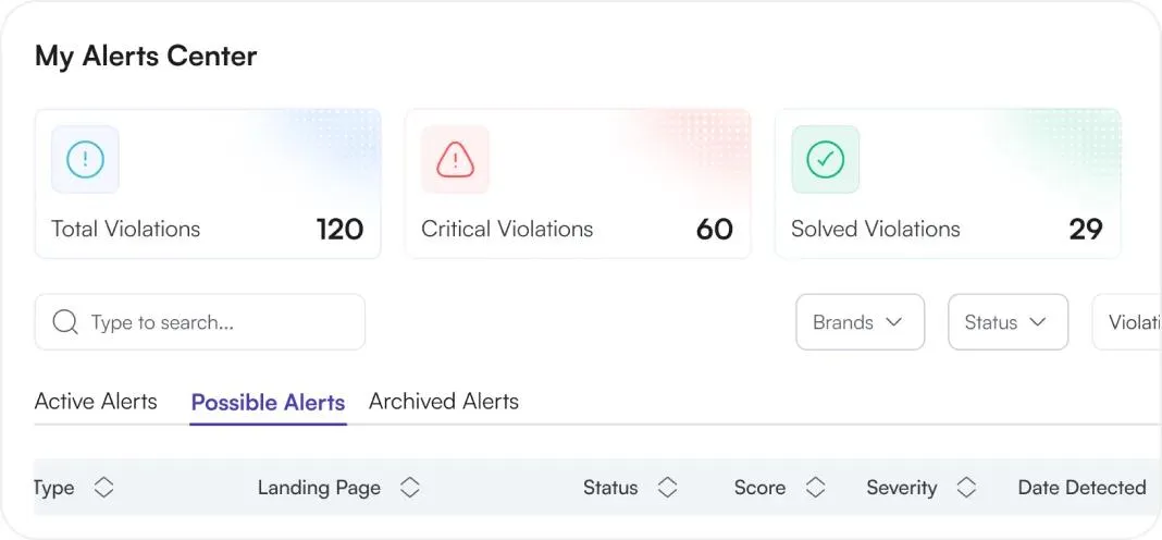
Brands depend on affiliates to promote them, but each affiliate publishes its own content. With no shared way to review it, violations slip through, and it is hard to tell which affiliate carries the most risk or what to do next.
Key design insights
- 1 Risk sits across many affiliates, brands and rules, and nothing ties it together.
- 2 A violation only matters if a team can judge how serious it is, see the exact words behind it and act on it quickly.
- 3 Brand rules must be thorough to set up, but not overwhelming to configure.
Challenge
How might we show compliance teams which affiliates carry the most risk, so they can judge each violation and resolve it without leaving the platform?
Decisions & Iteration
Violation analysis
At a glance
Short on time? This is the problem and the result for each point, without using the slider. Problem and result for each point.
- 1
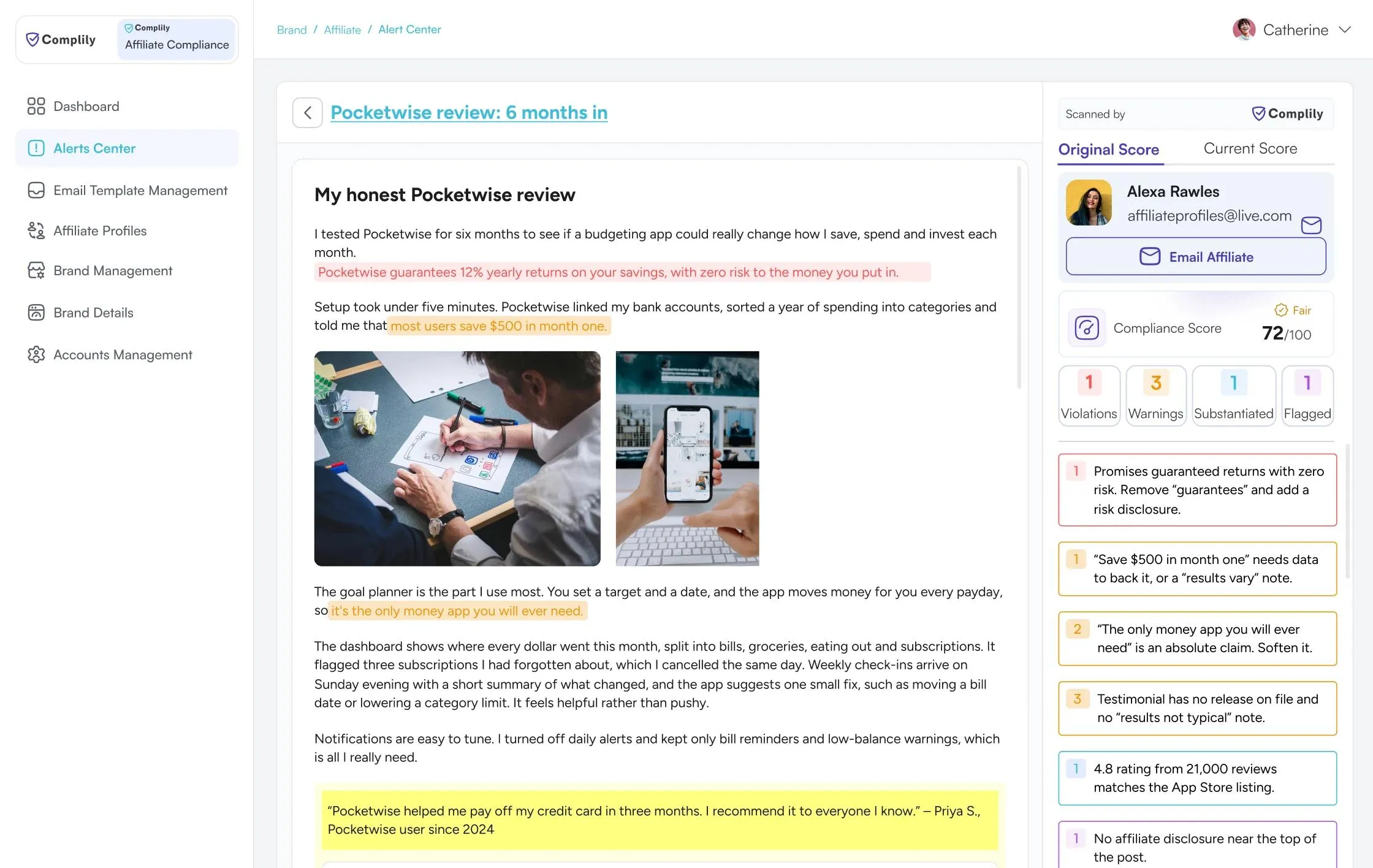
Highlights and issues looked the same
Problem
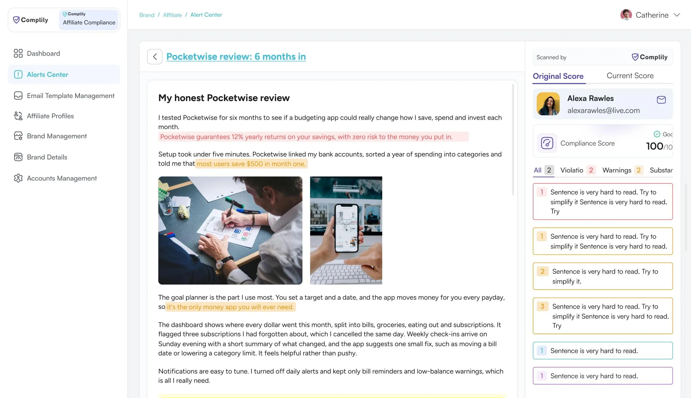
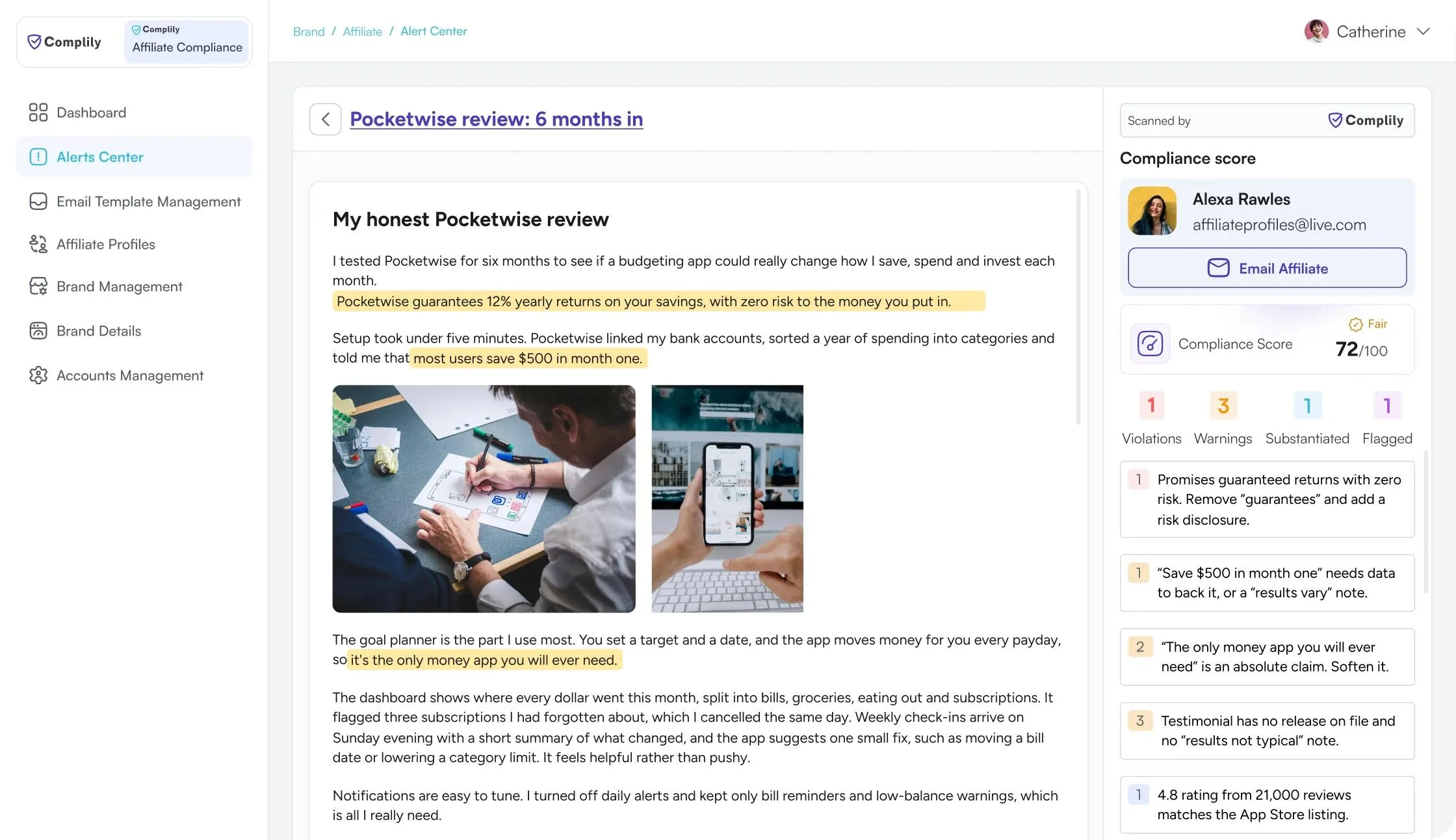
Every flagged phrase had the same highlight and the issue cards had no matching colour, so users could not tell which issue was serious or where it sat in the text.
Final: Colour links text to issue
Inline highlights and issue cards share one colour per severity, so each flag points to its card.
- 2
Violation types were not selectable
Problem
The four counts looked like labels and every issue sat in one mixed list, so a reviewer could not narrow it down to violations only.
Final: Each count is a filter
The four counts become buttons that filter the list, so a reviewer can focus on violations first, then clear the filter.
- 3
No way to tell if a fix worked
Problem
A reviewer saw one score. After contacting an affiliate, they could not tell whether the page had improved without re-reading it.
Final: Progress is visible
Original shows the score at detection and Current shows it now, so a reviewer can see if the affiliate improved and decide to close or follow up.
Based on design reasoning, not user test results yet.
Brand set up
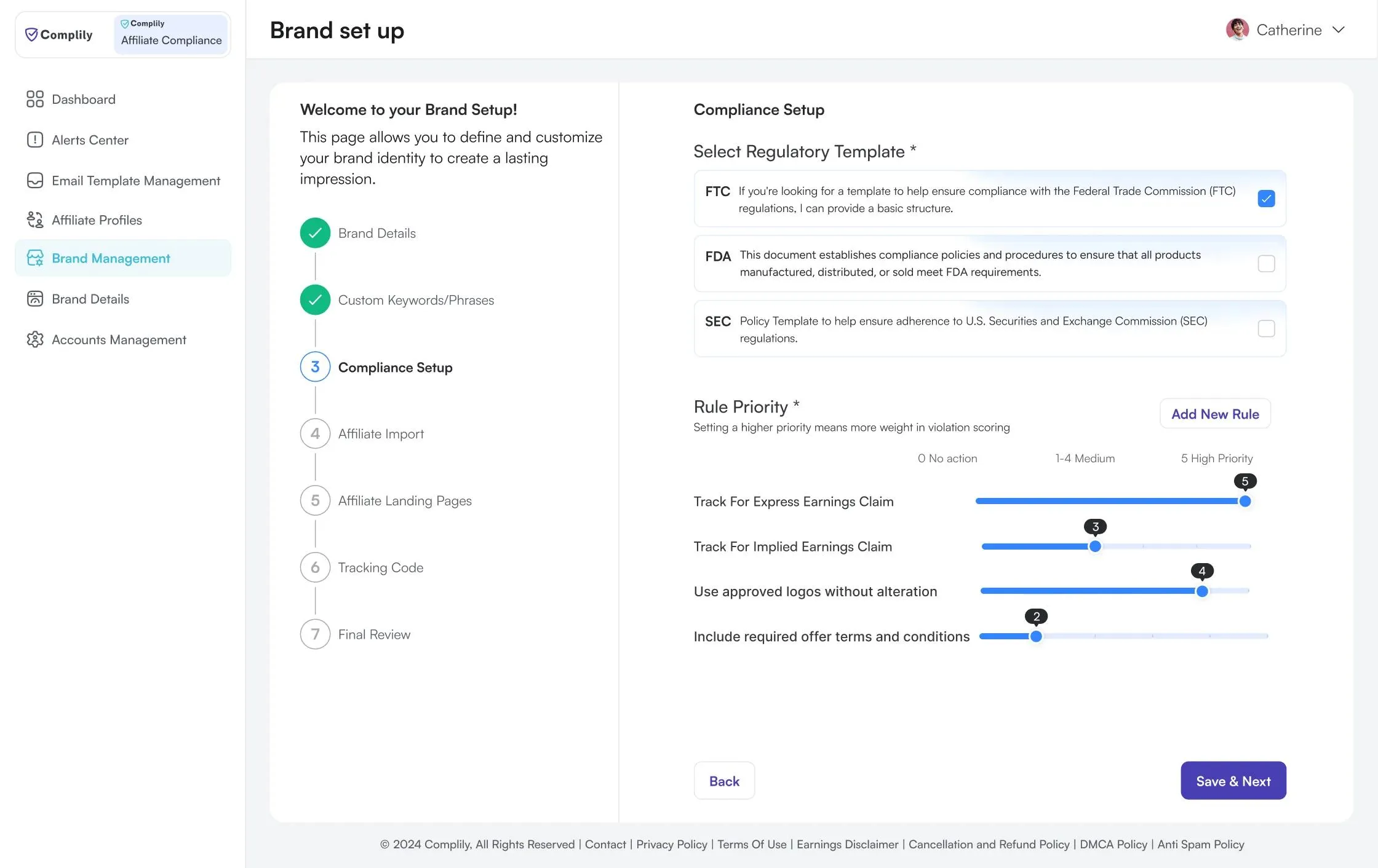
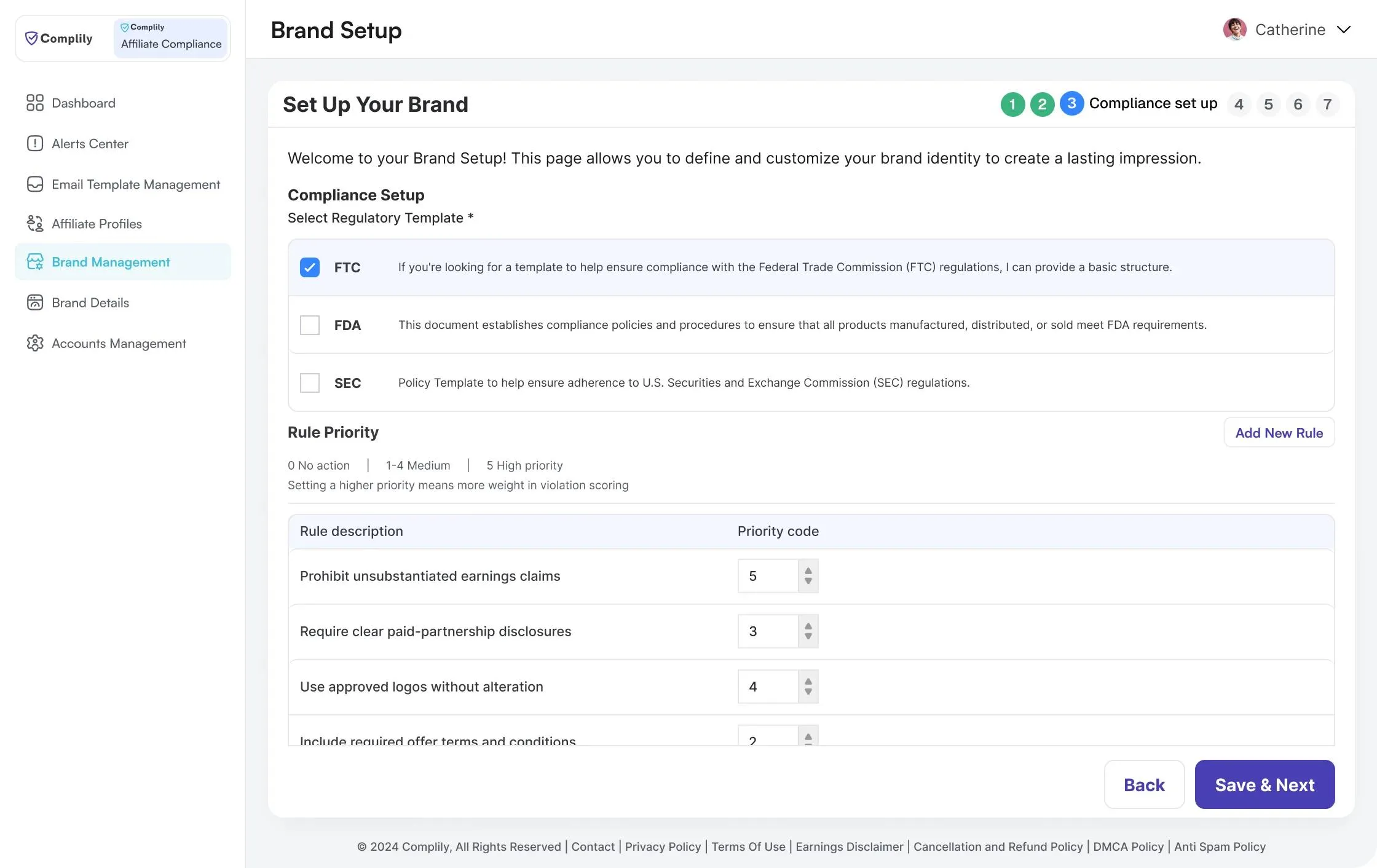
At a glance
Short on time? This is the problem and the result for each point, without using the slider. Problem and result for each point.
- 1
Only the current step had a name
Problem
Steps 1, 2, 4, 5, 6 and 7 were bare numbers, so users could not see what was done or what was left.
Final: Every step is named, with progress shown
A vertical list names all seven steps, ticks the finished ones and highlights the current one.
- 2
The scale sat away from the numbers
Problem
What 0, 1-4 and 5 mean was in a legend above the table, not next to the number being entered.
Final: The scale sits on the control
No action, Medium and High priority are labelled along the sliders, with a value bubble on each.
- 3
Relative weight was hard to compare
Problem
Priorities were numbers in a table, so users had to read each one to see which rules mattered most.
Final: Weight is visible at a glance
Slider lengths show which rules carry the most weight without reading the numbers.
Based on design reasoning, not user test results yet.
Final Solution
Set the rules, watch affiliates, review what gets flagged and follow up on it.
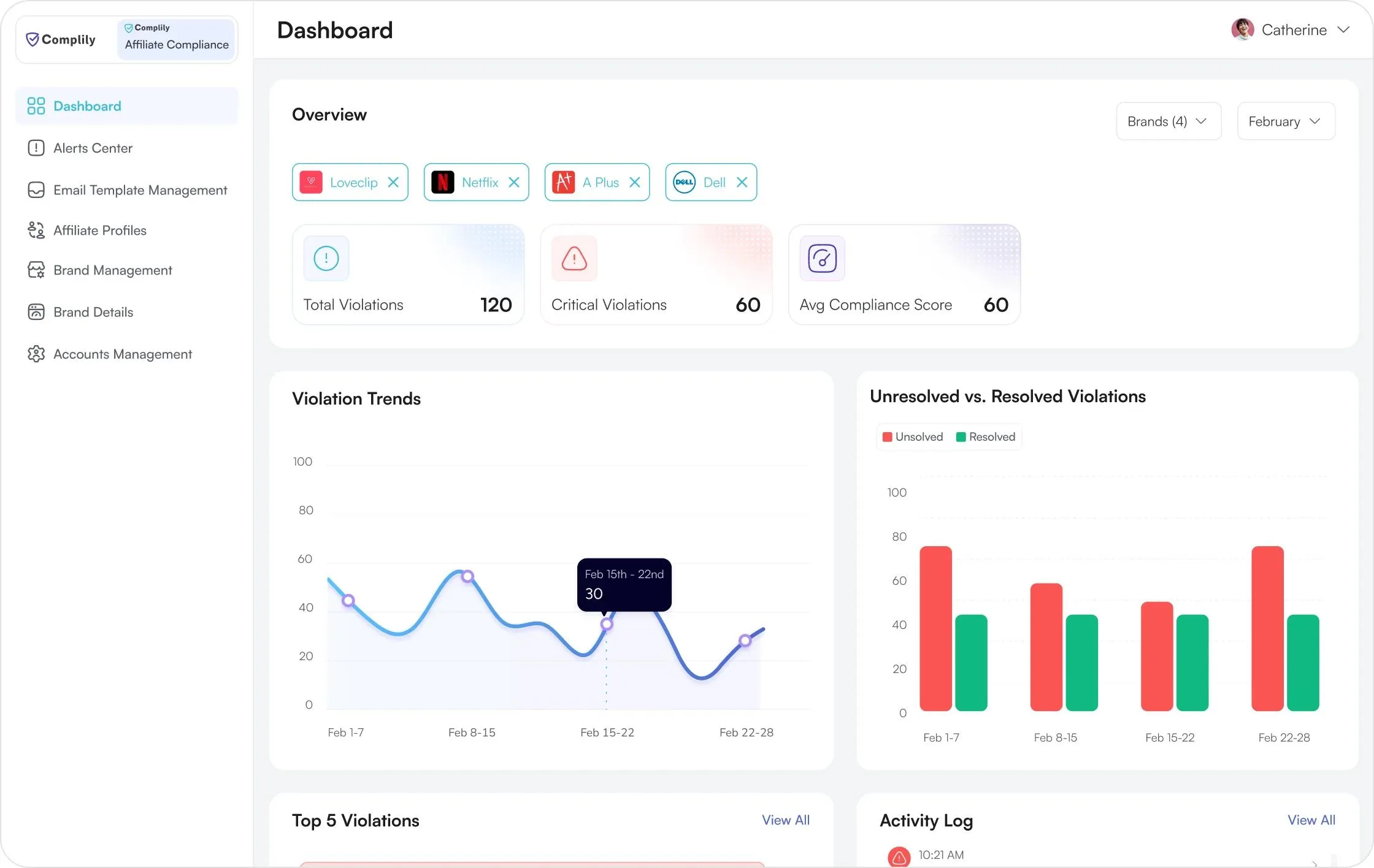
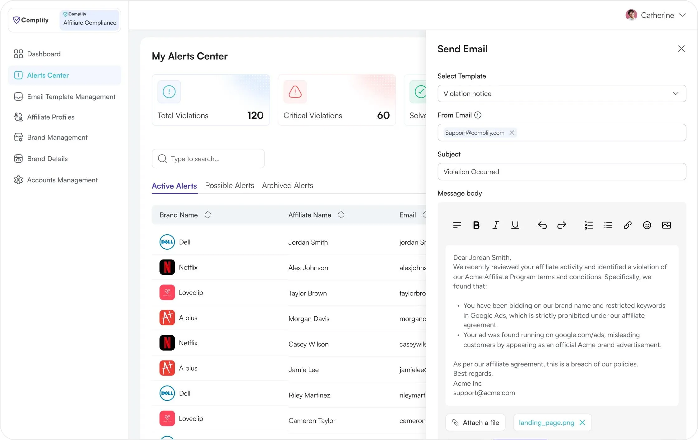
Dashboard
Total violations, critical violations and the average compliance score sit at the top, filtered by brand and month. Trends, resolved against unresolved, the top five violations and recent activity follow below.
1 / 4
Outcomes & impact
What the redesign is meant to change for compliance teams.
- 1
Affiliate risk, side by side
Teams compare risk across affiliates, brands and rules on the dashboard instead of piecing it together from reports.
- 2
Faster to judge and act on a violation
Severity colour links each flag to its issue card, and the count filters let a reviewer start with the serious ones.
- 3
Thorough brand setup without the overwhelm
Brand setup shows progress, scale and weight as you go, so a long set of rules stays manageable.
These are design goals and have not been measured with users yet.
Reflection
Looking back: the gaps I see now, the lesson I am keeping and what comes next.
What I'd do differently
- 1
Link each violation to its conversation
Violation History and Communication Log sit apart, so checking if someone was already emailed means matching dates.
- 2
Cut severity to four clear levels
The filter lists nine labels, from Critical to Debug and Trace. It would be better keeping only Critical, High, Medium and Low.
- 3
Let rule priority drive violation severity
Brands set a priority on each rule, but violations carry a separate severity. I would link them so setup choices shape review.
What I learned
- 4
Finding a violation is only half the job
The value is in helping a reviewer judge how serious it is and act, so severity, the exact words and the next step belong together.
What I'd tackle next
- 5
Make the whole path from violation to fix visible
Today the pieces sit on different screens: detect the violation, email the affiliate, log the conversation, and the Original and Current score. One status per violation (Detected, Contacted, Fixed, Re-checked) would tie them together and show reviewers what to do next.
- 6
Prevent violations, not only detect them
The Top 5 chart shows repeat issues. I would turn them into approved wording that affiliates see before they publish.